Welcome back to our New Year, New Features Series, where we’re kicking off 2011 with a bounty of new goodies for all BioGPS users. This week features a major update of our most popular plugin…
Interactive HTML5 Expression/Activity Charts!
“Gene Expression/Activity Chart” is by far the most popular BioGPS plugin. Many of our users visit BioGPS routinely to check their favorite genes for expression profiles across tissues and cell lines. These charts have been featured in presentations, referenced in publications, and are facilitating new biological discoveries of all kinds. Traditionally, the data chart has been displayed as a static image, take it or leave it. Well it just got better. A lot better.
To help users mine through this valuable data, we recently rolled out a new version that makes these charts much more “interactive”. We’ve outlined all the new bells and whistles here, together with a screenshot below.
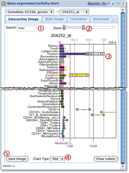
1. Sample Search
Save time and your eyes when picking out the few samples you’re interested in from a long list. There’s a new search box in the top-left corner of the Interactive Image tab. Type a few letters to highlight the matching samples on the graph, in real time!
2. Zoom In and Out
The standard view works well enough for most use cases, but once in a while, one bar with a large value squeezes the rest of bars to the left and makes the subtle pattern among these samples hard to observe. Now, by dragging either side of the Zoom Slider above the chart, you can zoom the data (horizontal) axis in and out to get exactly the view you need.
3. Numeric Value Labels
By moving your mouse cursor over each bar, the actual value of the sample will be displayed. Click the bar to make the value stay visible (with error margins), even when you move your cursor away. Great for preparing graphs for a presentation.
4. Plot Charts
Need a break from staring at the classic bar chart? Scroll to the bottom of the plugin and check out the “Chart Type” drop-down menu. Change it from “Bar” to “Plot” to get an alternate view. As an added bonus, the plot chart shows all data points from replicates (where available) as opposed to the averaged values shown by the bar chart.
5. Export Chart as an Image
You’ve zoomed to the proper scale, highlighted specific samples and added value labels, now you want to put your fancy, customized chart into your slides or manuscript? No problem! Click the “Save Image” button at the bottom-left of the plugin. A new window will open with a static, ready-to-save image of your chart, including every adjustment and tweak you made.
As always, we encourage everyone to use and include these charts in your work, free of charge. Just make sure to cite us and, if you’re feeling so kind, send us a note to let us know about your success!
Browser Support
The new Interactive Chart is supported by all modern browsers like Firefox, Chrome, Safari and Opera. Internet Explorer is adding support with the upcoming IE9, currently in Beta. If upgrading your browser is not an option, don’t worry, you’ll see the classic Static Image chart as usual.
Technology We Used
For those interested in the technology behind the scenes, the Interactive Chart is built on the canvas element, part of the new HTML5 spec. This is our first foray into the amazing possibilities of HTML5, with many more planned for the future. As always, please give us feedback and tell us what you think! We are excited about using these emerging technologies to continually improve the user experience.
Stay tuned!
This is feature #2 in our new weekly series: New Year, New Features. There’s so much to tell, we’re giving each goody its own article, so sign up for the email, subscribe to our RSS feed or follow us on Twitter to get the latest. See you next week!