In the early months of the COVID-19 outbreak, websites started emerging that pulled and visualized epidemiology data. This had tremendous value, as researchers could quickly visualize epidemic curves for varying locations to get a sense of how the virus was spreading. Some data manipulations still could not be done easily, however, such as comparing metro areas, overlaying normalized epidemic curves, or programmatically accessing the underlying data. Karthik Gangavarapu, doctoral student in the Andersen and Su Labs at Scripps Research, joined Dr. Laura Hughes and the team at the Andersen, Su, and Wu Labs to build a tool that makes it easy to manipulate and export COVID-19 and SARS-CoV-2 data.
Outbreak.info was created as an open source, standardized COVID-19 data aggregator – a single tool that allows researchers to visualize and download epidemiology data or search for publications, datasets, clinical trials, and more.
In the Andersen Lab, Karthik uses genomic epidemiology to better understand the spread and evolution of disease outbreaks. Beginning in early March, Karthik used outbreak.info to start modeling COVID-19 infections from mortality data. In the early days of the epidemic, delays in testing caused a lag in the reporting of new COVID-19 cases. Uncovering the true number of infections and identifying transmission patterns across various regions was extraordinarily difficult at that time, Karthik stating it ‘was probably one of the hardest projects [he’d] worked on.’
 |
|---|
| Karthik Gangavarapu, doctoral student in the Andersen and Su Labs at Scripps Research |
He found himself using outbreak.info to do preliminary modeling, viewing epidemiology curves for different US states to find the dates of their first cases. In most places, the first reported case was not the first case, but he tried to estimate the true number of daily infections. He tested different modelling approaches from literature to estimate infectious cases over time (with some uncertainty and assumptions about the time to death distribution), while also using the data to test the model.
“I would query a certain location, look at when the first case was, look at when the first death was, and then look at the lag time. And it gave us very good intuition about whether our modeling made sense or not. [Outbreak.info] really helped us do that very easily, especially early on with places like New York, Louisiana, and Washington.”
All COVID-19 data aggregated by outbreak.info is available via open source APIs. Karthik explained that the outbreak.info API made it much easier to do downstream modeling of infection numbers.
“Given that outbreak.info standardizes all of the cases – it gets the population, generates per capita metrics, rolling averages, and all of that – it was just so much easier for us to use outbreak.info to do that downstream analysis, which is why the R-package was also very helpful.”
Karthik continues to use outbreak.info’s API to model COVID-19 infections from the number of deaths per day, stating, “We modelled daily infections for every metro area in the US with the population above a million, which has been super easy to implement because all the data is there. We just have to pull it from the API.”
While he continues to use the API as part of his research, he also uses the interface to regularly check infection rates. “What sets outbreak.info apart is the ease at which you can compare many different locations,” he shared while describing outbreak.info’s epidemiology dashboards. “Let’s say you want to plot two countries or one country and a county of comparable population – you can compare across many locations and then easily make these charts, export them to SVG, and you’re good to go.”
| |
|
Comparing locations around the globe, while being able to overlay their epidemic curves and normalize to population with a prebuilt tool has proven to be exceptionally useful for Karthik’s research.
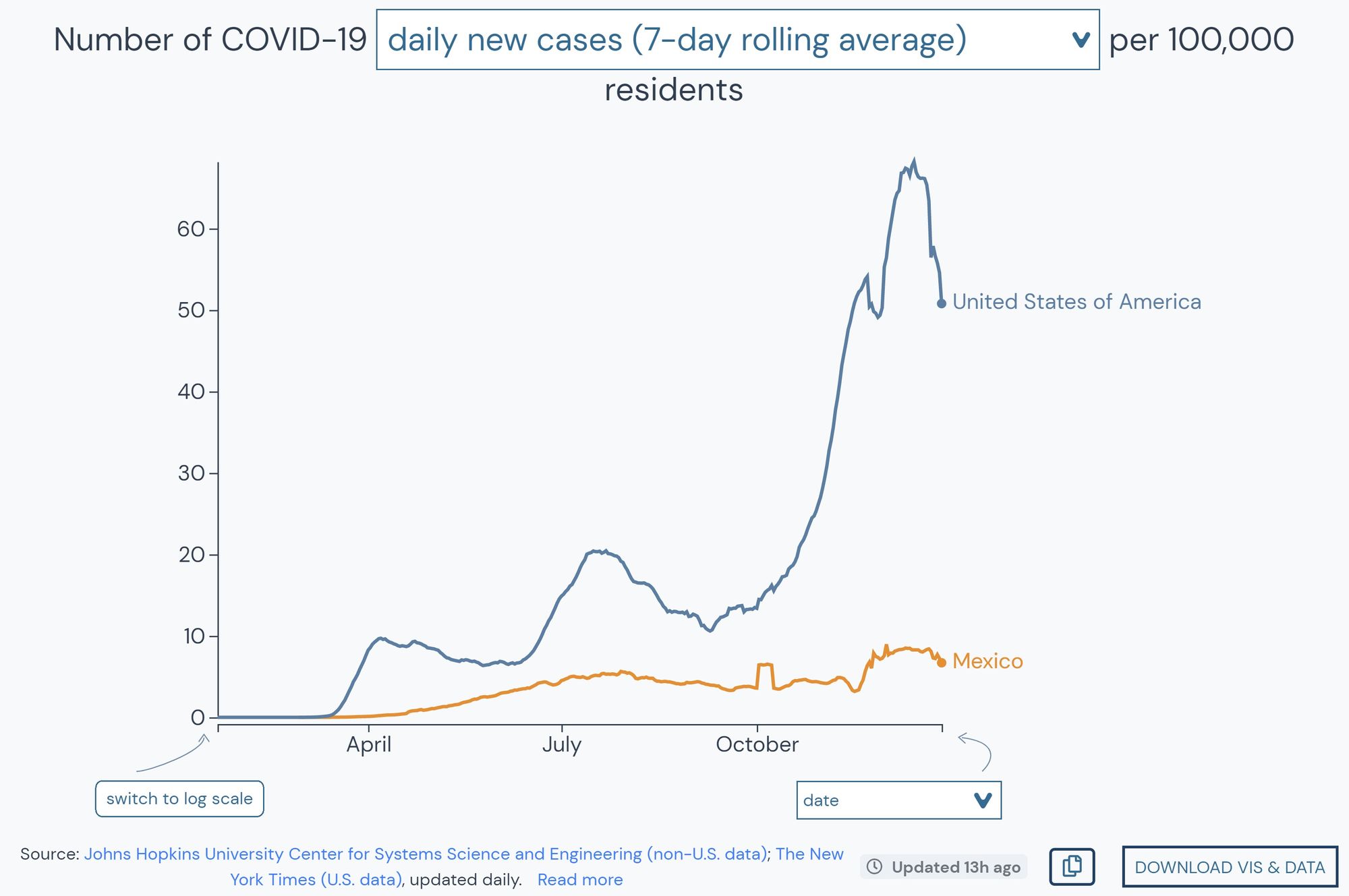
“We were looking at cases in Mexico and so comparing to the US, I literally just opened the outbreak.info maps, and we could actually subset by the number of infections by a hundred thousand people. We were easily able to get a baseline to compare between Mexico and the US. That’s got very high utility for downstream analysis.”
He emphasized the thought and expertise the team put into creating the interactive maps that drill down to state, county, and even metro level, further elaborating this makes it particularly easy to query, for example, counties that have high COVID-19 incidences. Nonetheless, as outbreak.info aggregates epidemiology data from primary sources, this data comes with some biases. Learn more about outbreak.info’s data sources.
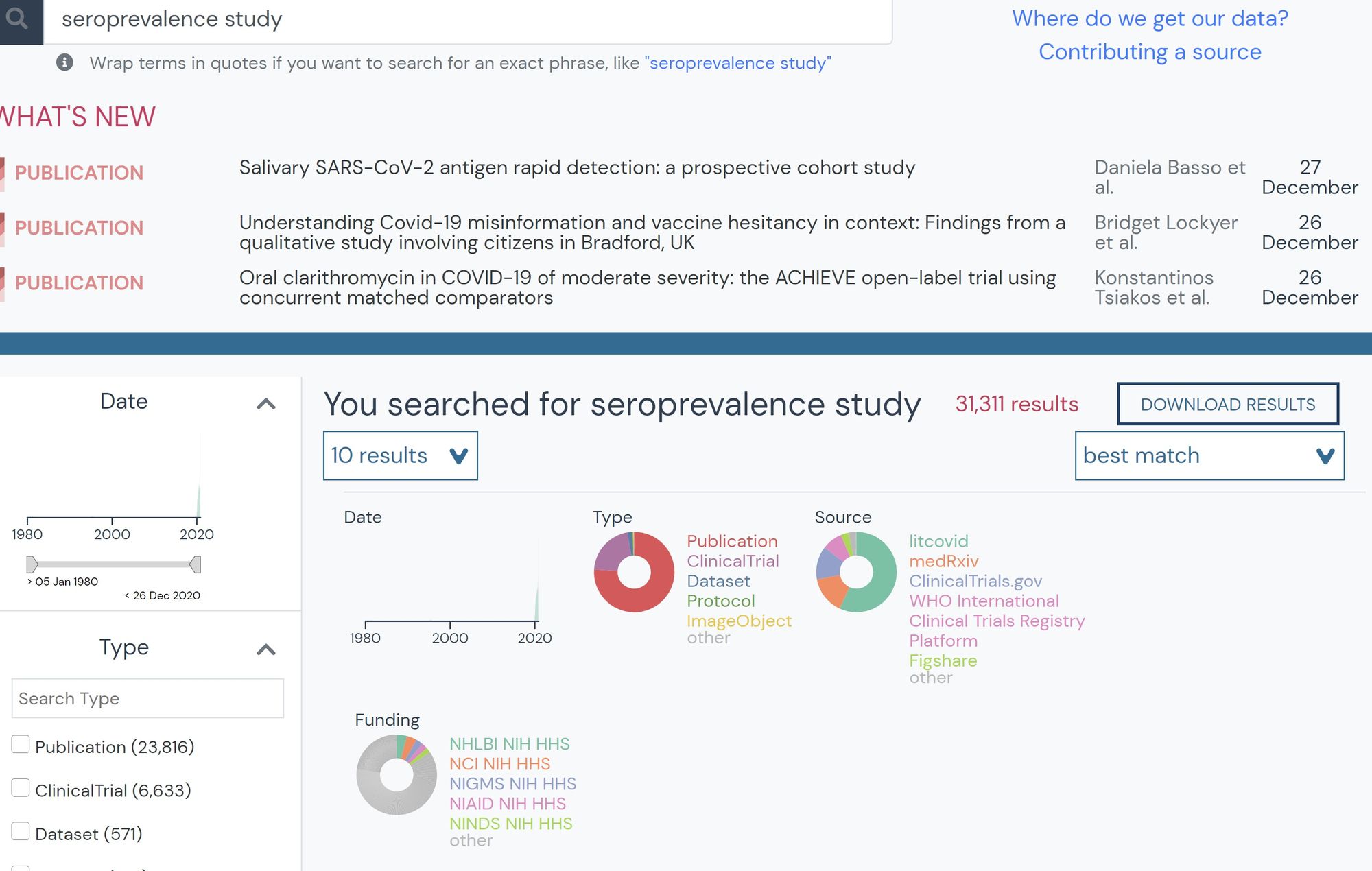
Karthik has also found the searchable resource database useful, mainly for searching seroprevalence studies during a time when so many were being published. These studies analyze blood samples, determining the rate at which members in a population have COVID-19 antibodies. This helps him determine true infection rates and validate his model. He states that especially now, as so much literature has become available and with new preprints released every day, outbreak.info’s searchable interface is a useful tool for biomedical researchers.
| |
|
Outbreak.info’s extensive list of features, including its open source API, has proven to be a handy tool for studying infectious disease genomics and computational biology. Read about more ways to use outbreak.info’s interface to solve research problems.